Use Colors Appropriately to Update your Décor
Color is one of the things that make life meaningful, you can find
a reflection of each one of your moods, preferences and feeling in colors:
they help you reflect your personality. But you do not have to be a
top-notch interior decorator to make colors work for your home. Armed
with a few tips, you yourself can make a colorful difference to how
your home looks, feels and appeals to you.
Neutral Shades vs. Rich Hues
Neutral palettes are of course the safest. A rustic, restful simplicity
may be nice for a time: a Tuscan décor, for instance, but it can also
get boring after a while. With the turn of the century, more and more
people prefer their homes to be rejuvenating and fresh. Colors are in
demand once again, and you should perhaps seriously consider getting
some into your personal space this spring. Blue, red, purple, green,
orange and yellow are the new favorites: when used with consideration
and insight, they can give your home an entirely new image.

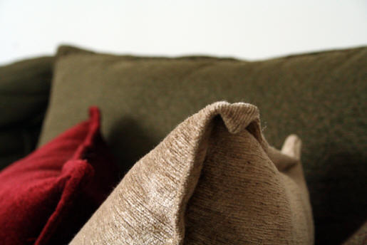
neutral decor throw pillows
You need not redo all your white or cream painted walls in order
to reach for color. You could bring in colors by painting a single wall
in a room, and leaving the rest as they are, so updating your décor
need not be either expensive or time-consuming. Neutral colored walls
provide the right background for one wall in rich color, and allow for
a room to be restful despite a touch of vigor. You could consider a
few of the following color suggestions and possibilities for your home:
Romantic Purple
A single purple wall over your bedstead in a white bedroom with purple-accented
furnishings and drapes can introduce a new note of passion and romance
into your life. Avoid using purple in the study or kitchen however,
because this color may lose some of its charm in these areas and not
convey the focused atmosphere of a study or the welcoming warmth of
a kitchen.
Tranquil Blue
A hallway or staircase which gets enough natural light could be your
place for a rich Mediterranean blue. Cobalt or cerulean blues are good
too. Avoid the darker shades like navy and prussian which can make the
space look dingy. Not only does blue look summery and bright with your
cream or white walls, it is a great place to hang up family photographs
with cream, black or silver frames. Hang up tribal masks, prints, pictures
or paintings with a touch of turquoise, or add sheer turquoise curtains
on the windows at the top of the stairs for an airy, beach-side look.
You could also add accents of dull gold in terms of artifacts, or Italian
pottery in Mediterranean colors. Blue does not do very well in living
rooms, bedrooms or kitchens, it is best used in passages or hallways.
Sophisticated Red

Red Walls neutral furnishings
Red walls look awesome with neutral furnishings. A cherry red wall
in your living room would do very well to give a vibrant accent to the
other pale cream or white walls. Use crimson or maroon reds only if
you are very sure that is what you want. You can either go the cream
lacy Victorian way with your sofas and cushions in the living room;
add greenery for contrast and a touch of nature by introducing potted
plants. Or, go sporty with solid blacks, creams and browns, even hot
pinks. This would go very well with ultramodern Italian steel furniture.
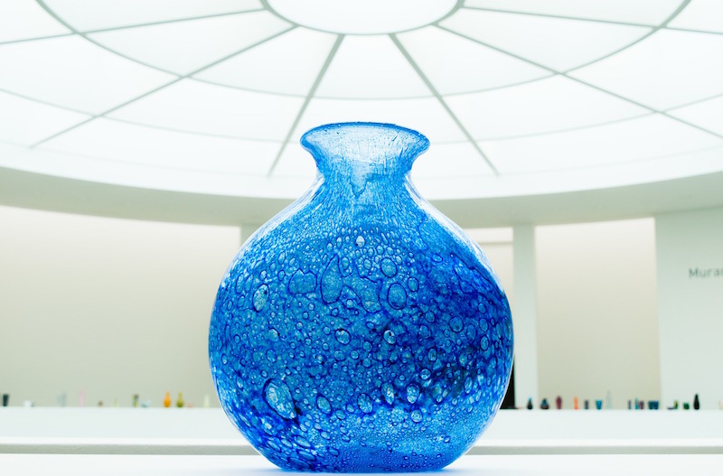
A few shiny silver knick-knacks or picture frames, or maybe Murano glass
vases would add that extra dash of exotic color and translucence. The
idea is not to have too much of red, use it only to underline your vibrant,
postmodern personality. An orange and white scheme would have much the
same effect, if you prefer a cheery and young feel instead of edgy sophistication.
Mellow Yellow

yellow wall guest room
Yellow can be a great idea for a study, a guest room or a kitchen.
Three walls painted a very pale creamy yellow, and the remaining one
a honeyed, buttercup shade could brighten up a room which does not receive
much natural light. Pale yellow and green vines or floral motifs on
a wall paper can also be used to denote a sort of Tuscan air while still
retaining an element of energy. For yellow walls it is safer to stick
with white, pale yellow or cream furnishings, and maybe add touches
of dull gold on paint frames and artifacts. Plants and flowers potted
in stoneware would do well in this room as will wrought iron furniture.
A white and bronze or copper Tuscan lamp can add to the serene yet lively
feel of a sedate yellow room.
Soothing Green
Dark, moss, or pale green walls call for furnishings in white or
cream. Also make sure you leave one or more walls in white or cream.
Emerald greens are best avoided. Use browns, beiges, tans, blacks and
traces of pale yellows and yellow-greens for furnishings to make the
most out of a green living room. Dry decorations, or paintings with
beige accents, and rust or black frames would work well. You can go
for shiny rust-colored cushions, and possibly bring in a gray stone
trickling water-fountain to complete a rich, soothing, oriental look.
Do’s and Don’ts for Using Color
While using colors, it is easier if you do different rooms in different
colors. However, do not put more than one vibrant color in the same
room, or you might end up making your home look like a fast food-restaurant!
If you have a small home, you might want to be very careful about introducing
too many colors in your rooms. Choose one room or two in an apartment
to accent with colors so that they stand out and enliven the house.
Too many walls in different colors can look jarring.
The colors in the living room and the dining area would also depend
to an extent on who and how much you entertain, bedrooms should have
colors soothing to your senses, and the kitchen should have warm colors,
and not blue and green. Keep in mind that the shade and tone of a color
is a very important factor in your decision, and give all fluorescent
shades a wide berth. Complete the color update of one room to see how
you like it before you venture into the other rooms. Remember, not all
your rooms may need an update.

neutral colors mantle
The idea is to provide colorful highlights while maintaining the
inherent harmony of the home, not to overwhelm the eyes with a jamboree
of colors. Moderation is key. It is perfectly acceptable to leave a
few rooms of your house with their walls in cream, white or pastels.
They can enhance the appeal of the selectively painted bright walls
by playing up the contrast.
In these untouched pastel rooms, carry out the bright color themes
in terms of furnishings, accessories or paintings, because changing
the color of the wall paint may not be the only way to bring in the
accent of new colors into your home. For instance, you can add accents
of green in sofas, cushions, furniture, paintings and potted plants
in a room with cream walls, and make the room look predominantly green.
A children’s room does not always need extra-colorful walls, it can
have colorful stick-ons and drapes on pale walls and still look vibrant
and cheerful.
Choose your lighting with care, warm yellow lights and white lights
may change the look and color of a room, and that should always be kept
in mind while choosing paint colors for your walls. For instance, it
would be best to provide warm yellow lights in rooms with green or yellow,
as white lights may make them look harsh or sickly. Include the color
and type of flooring you already have into your equation, a green wall
would be great with a wooden finish or white marble floor, but with
a red mosaic floor it can look ghastly.
The suggestions given here are just that: suggestions. They provide
a springboard for ideas on what you can do with colors to your home.
Depending on where you live, the way your home is built, what you do
and your likes and dislikes, you can tailor the use of colors the way
you want. You will never know what would look good till you experiment,
and the best way to do it is color a big cardboard and put it up against
the wall under consideration to see how you like it. So reach out for
color today: depending on your budget, ambitions and preferences, not
only can you update the décor of your home like a professional, you
can also have heaps of fun doing it!
By Damyanti Ghosh